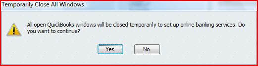
Unfortunately, the QuickBooks architecture required all other windows within the program to close to run the wizard. While I advocated that the program simply close all the windows and save all states and data, resources were not available to do this, so this compromise was necessary in case users had any windows with unsaved data open.
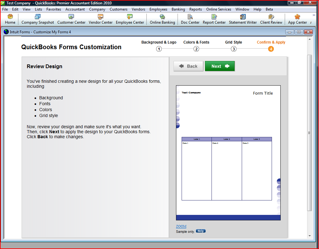
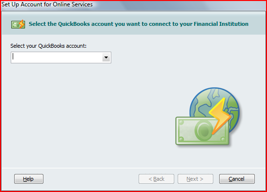
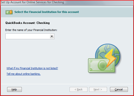
Because the wizard had a different amount of steps depending on a number of variables, we didn't design in a progress indicator. So the first step is very simple, with a simple instruction
.
The first line in the next step confirms the choice of the previous step so when users select from the very large financial institution list, they can be sure they are selecting the right one for the QuickBooks account they have selected. (A QuickBooks company file can have many bank accounts.) The first link is for the most likely question a user might have at this step.
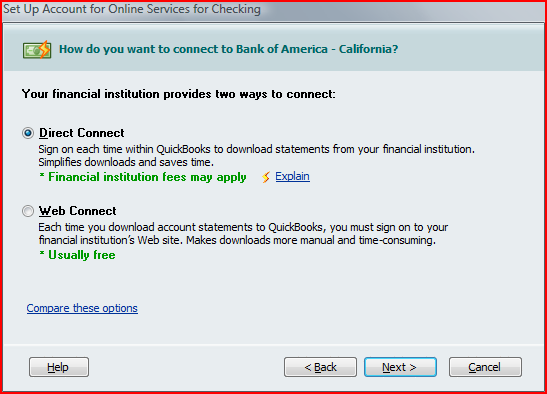
This step is probably the most crucial decision in the online banking setup process. Each choice has a brief description describing the consequences of each. The link leads to a help topic that I wrote (below) that provides a more fuller explanation. This is a good example of layering of information. Note that the link text gives you a good idea of what you expect to find if you follow the link.
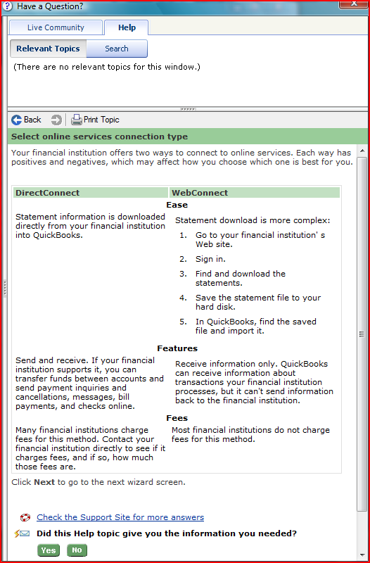
This is the help topic that more fully describes the difference between DirectConnect and WebConnect.
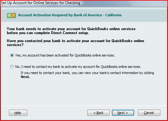
This step is necessary because of the complexity of setting up online banking between a QuickBooks account and a financial institution. Typically, a financial institution must also activate an account to allow QuickBooks to use the DirectConnect method.
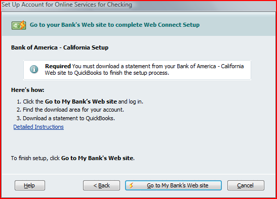
The final step for WebConnect allows users to go directly to a financial institution's website to download their first statement for import into QuickBooks.